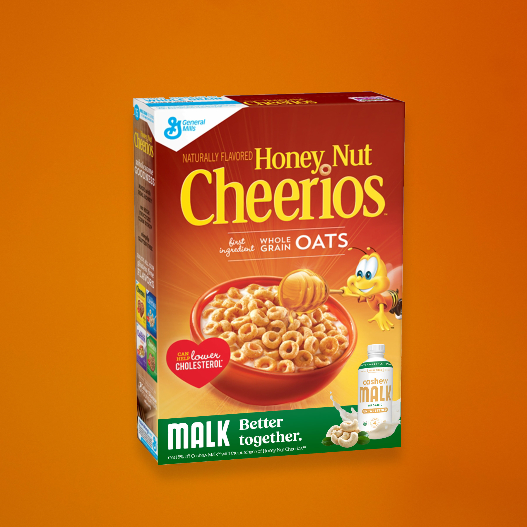
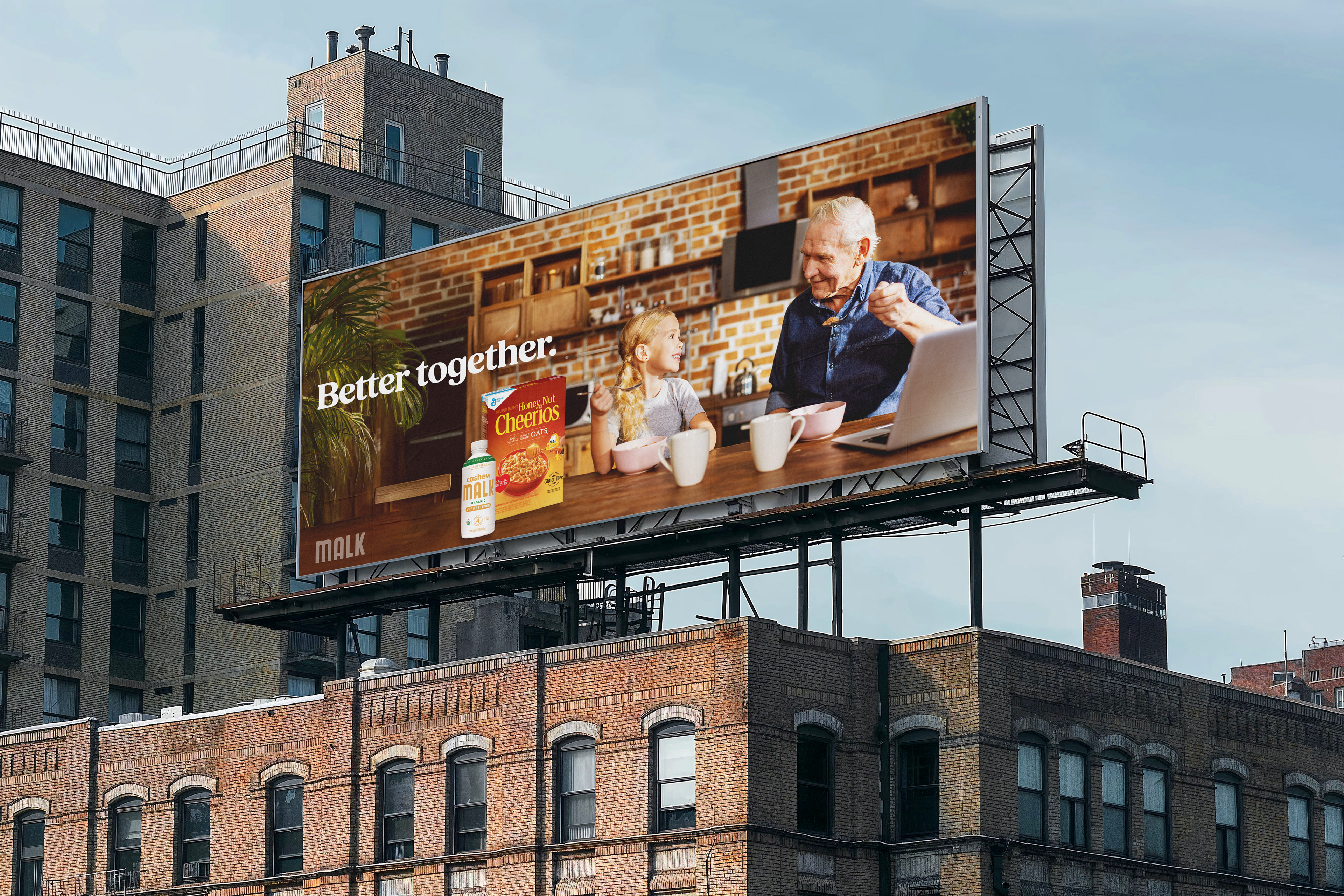
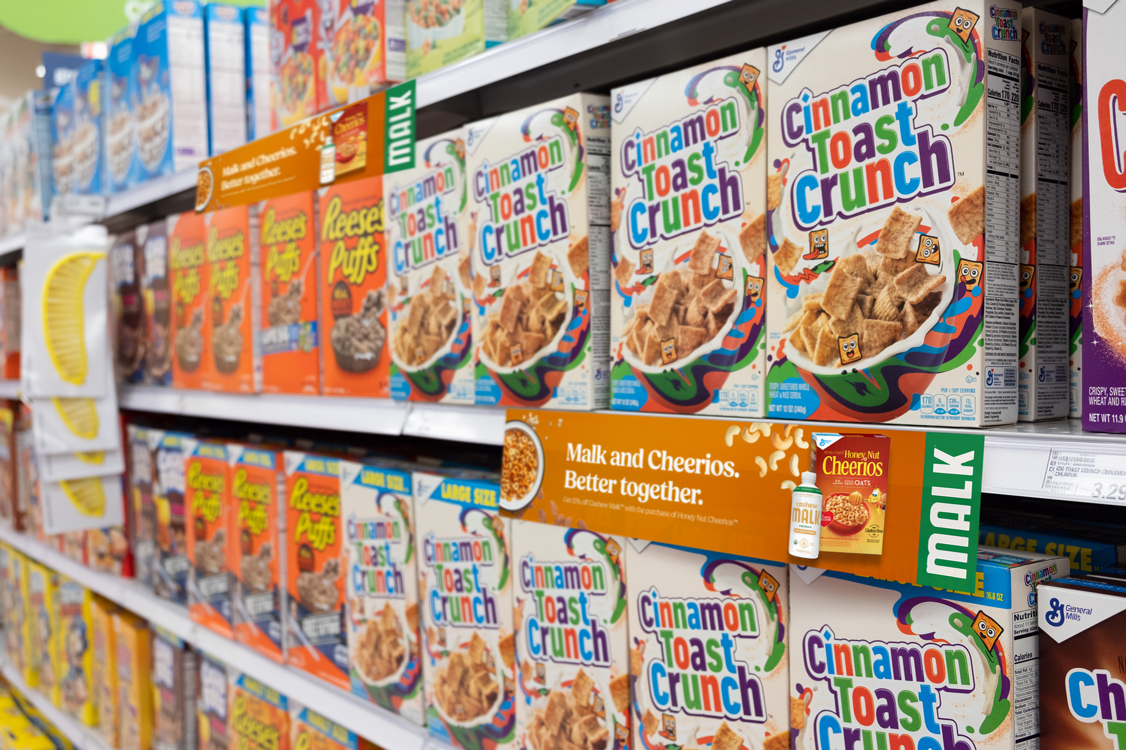
Better Together is a campaign created for Advertising Concepts II at the Alberta University of the Arts. The goal was to introduce MALK Organics cashew milk to an unexpected audience: Baby Boomers. To appeal to a more traditional audience that may be hesitant to try cashew milk, my strategy focused on blending the new with the familiar. I paired MALK cashew milk with Honey Nut Cheerios, a classic and well-loved cereal that has strong positive brand affiliation with this generation.
The visual identity draws from both brands. A warm honey-gold palette inspired by Cheerios conveys nostalgia and familiarity, while a dark, organic green taken from MALK packaging communicates natural ingredients without feeling overwhelming. The primary typeface, Fields, was chosen for its fresh and modern feel while still echoing the warmth of more traditional advertising fonts, helping bridge the gap between the two brands.
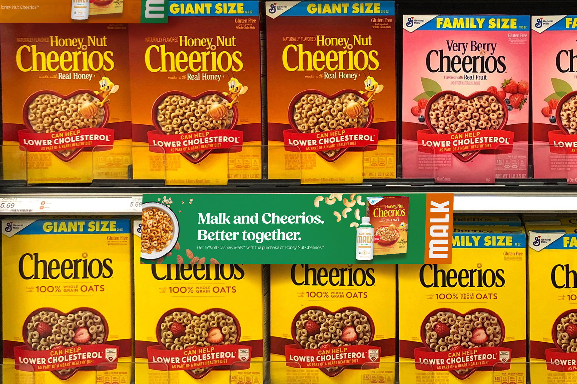
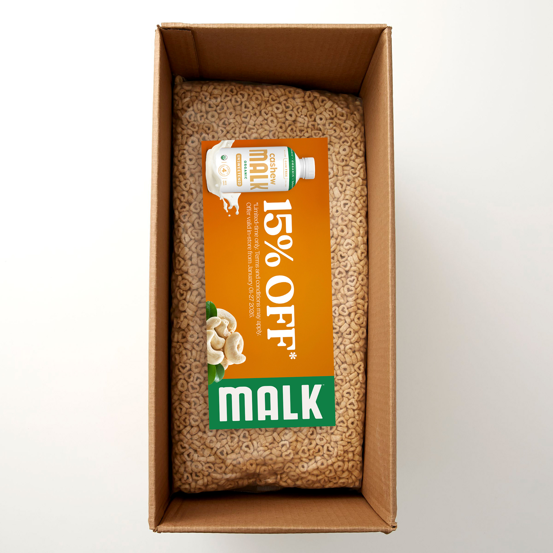
This strategy was applied across key customer touchpoints including billboards, shelf talkers placed near familiar cereals, and physical coupons inside Cheerios boxes. These placements were chosen to influence Baby Boomers during real shopping moments, from the drive to the store to decision-making in the cereal aisle. The campaign demonstrates how thoughtful research, typography, colour, and placement can shift perceptions and make a modern product feel approachable.