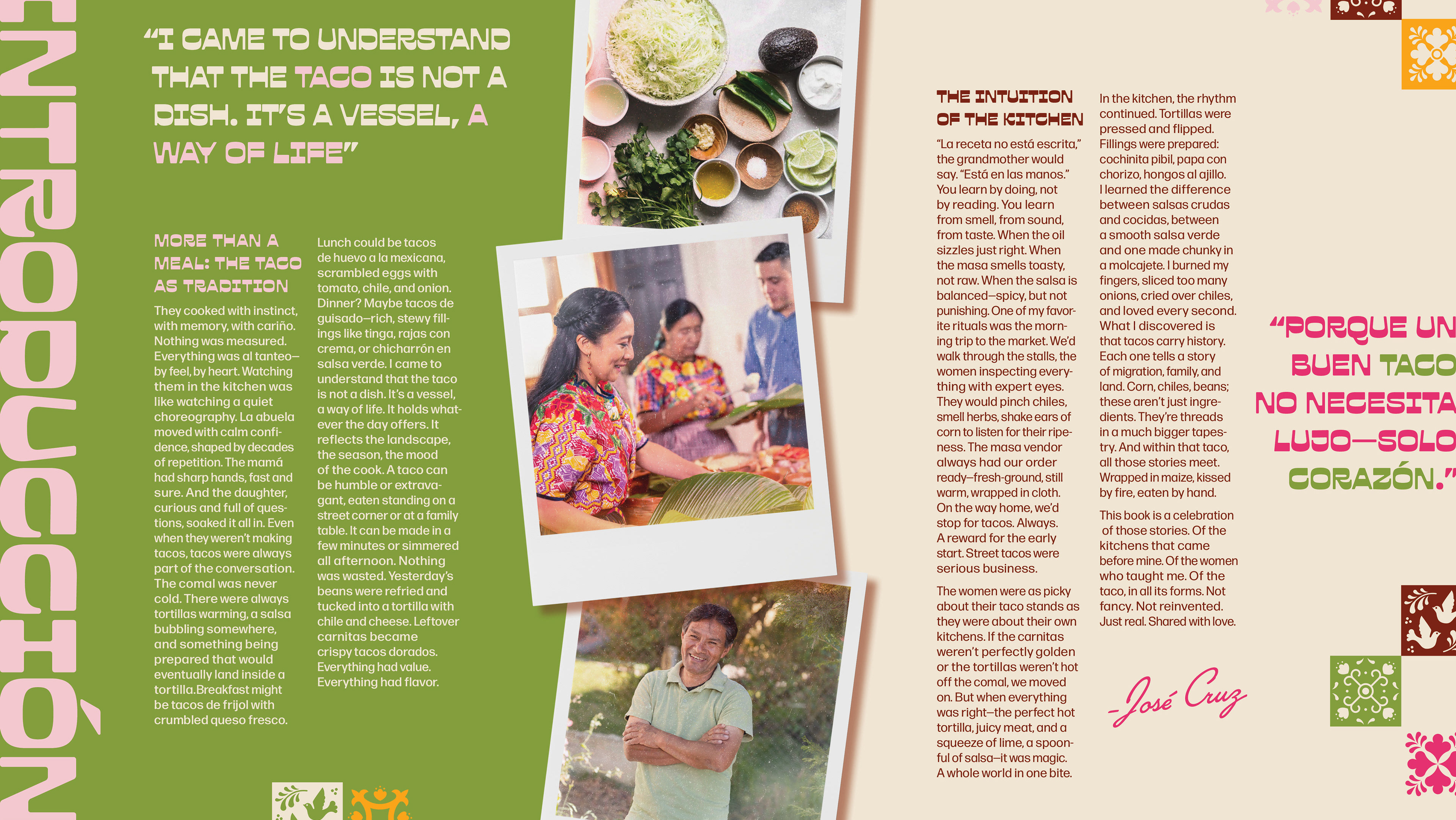

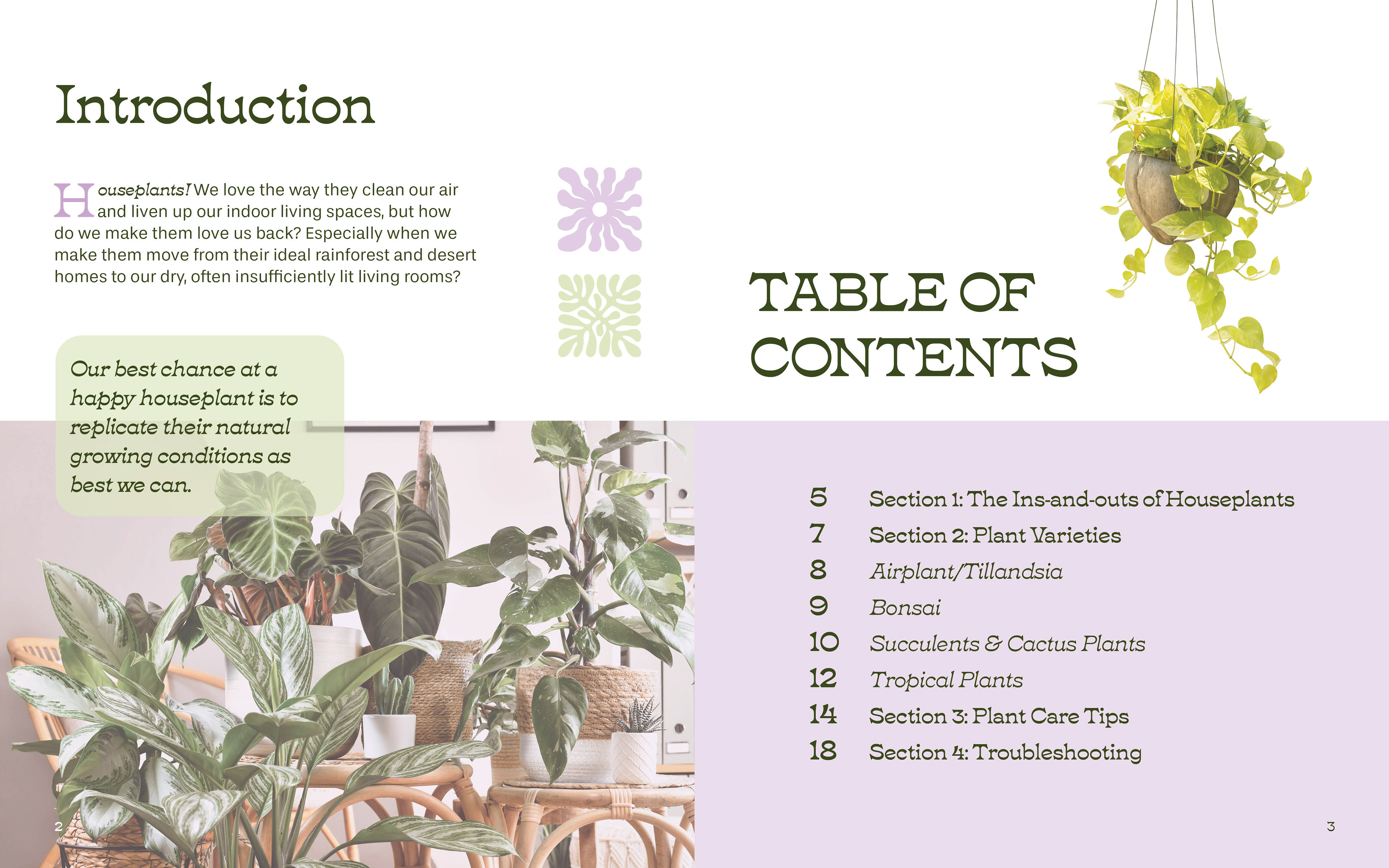
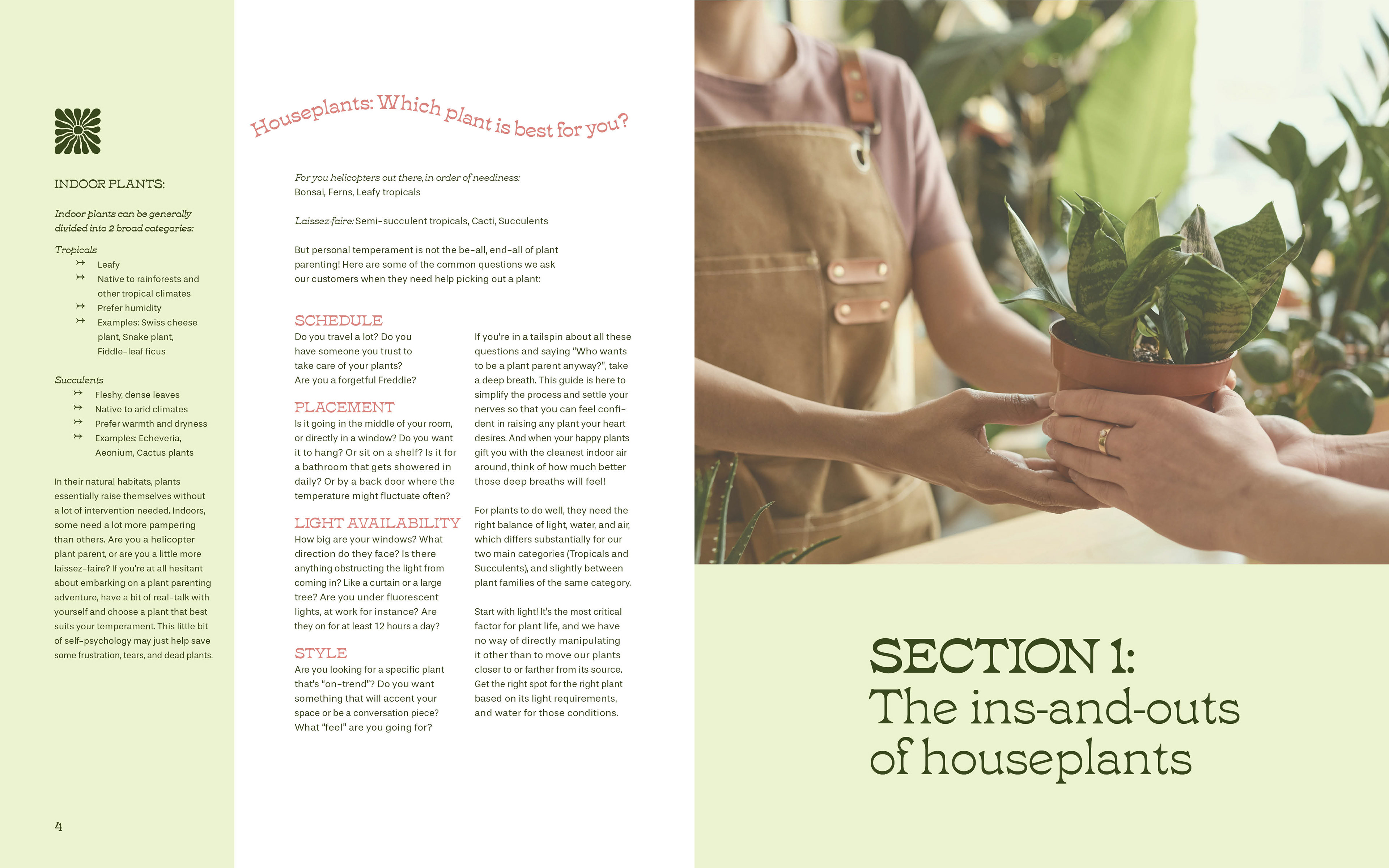

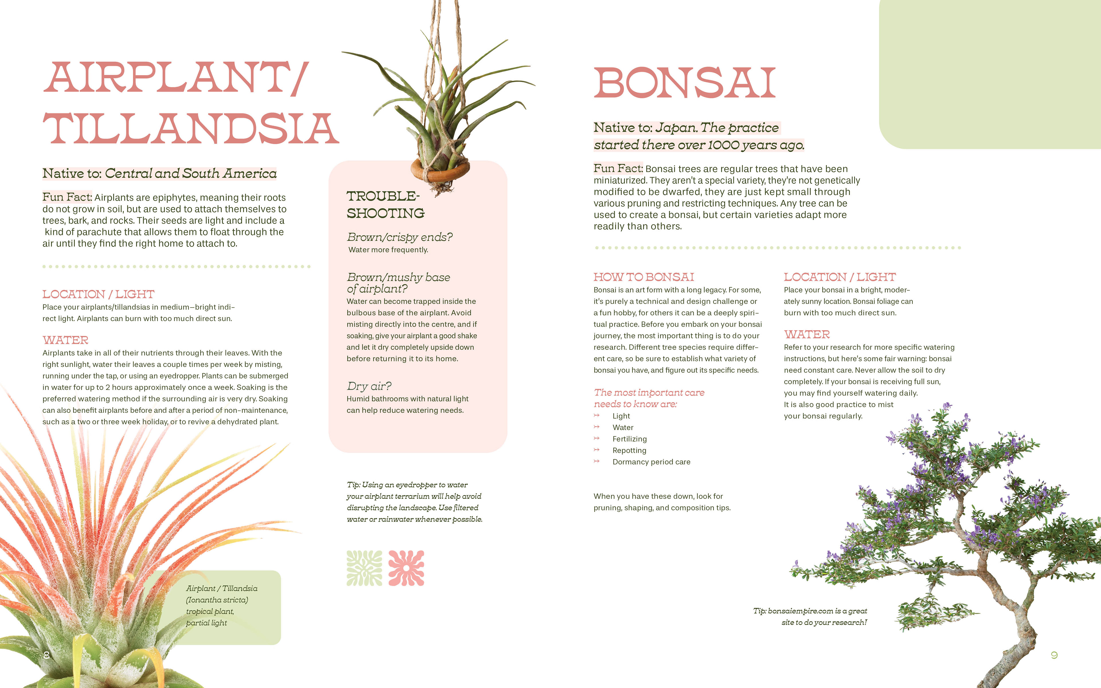
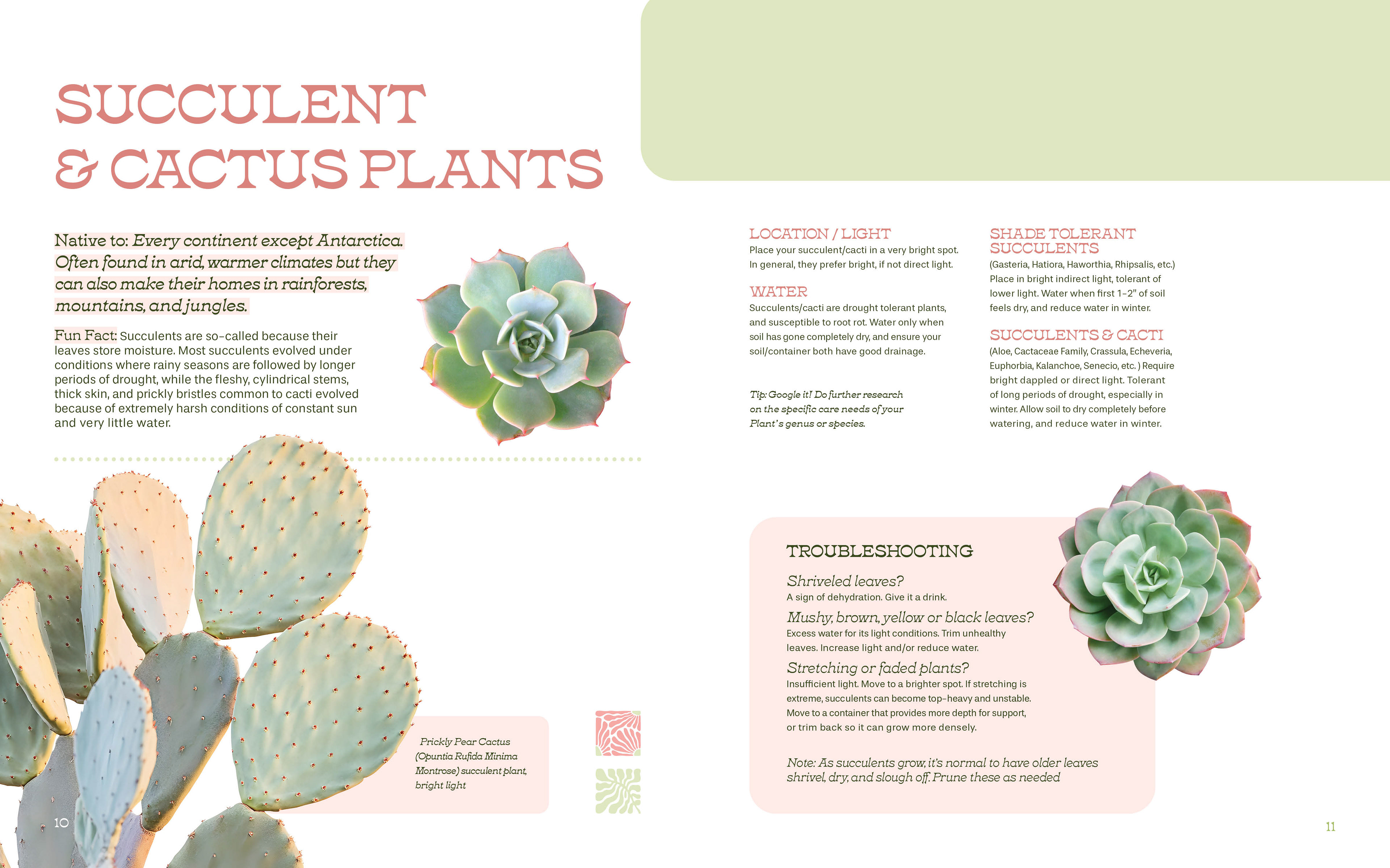


This is a layout design I created for a typography assignment. Through this project, I have developed my skills with the baseline grid, as well as paragraph and character styles. The content for this book was provided as part of the assignment, and all images and vector graphics are from Adobe Stock.
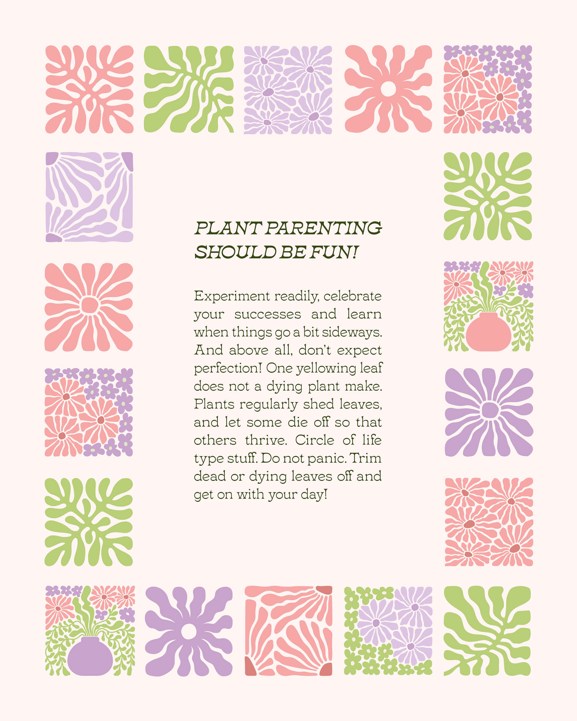
For this class project, I chose to go with a very specific audience and design style. My audience is women (mainly) who are 20-30 years old and who have just moved into their first apartment or home. These individuals likely don’t have experience owning their own houseplants. I wanted to target young, Gen Z-aged women who are trendy, like to shop at Urban Outfitters, Indigo or Anthropology, and use Pinterest. This audience would pay attention to the style of the product they are purchasing, and they would largely base their purchase on a beautiful cover or pretty colours and page design. For this reason, I was careful to pick images, illustrations, colours and fonts that adhered to the style that my target audience would appreciate. To make this content accessible and engaging, I used different colours for each section (lilacs, greens and pinks). By utilizing negative space and cohesive elements, I made the content of my layouts easy to navigate. I also divided the information into chunks, with sidebars, troubleshooting, and tips easy to distinguish from body text. This way, a reader can quickly scan through the book to find the section they are looking for. I carefully chose images that related to the content in each section, to create a sense of flow and cohesiveness. Through this project, I learned to use paragraph and character styles to make easy changes to size, style, and colour of type quickly and efficiently.