Fresh Water Soap Label
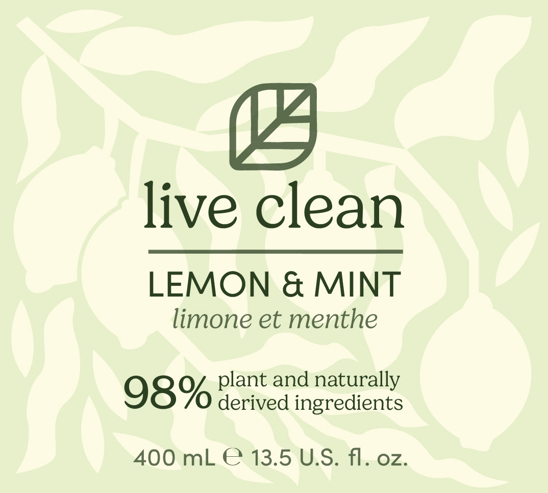
Lemon & Mint Soap Label
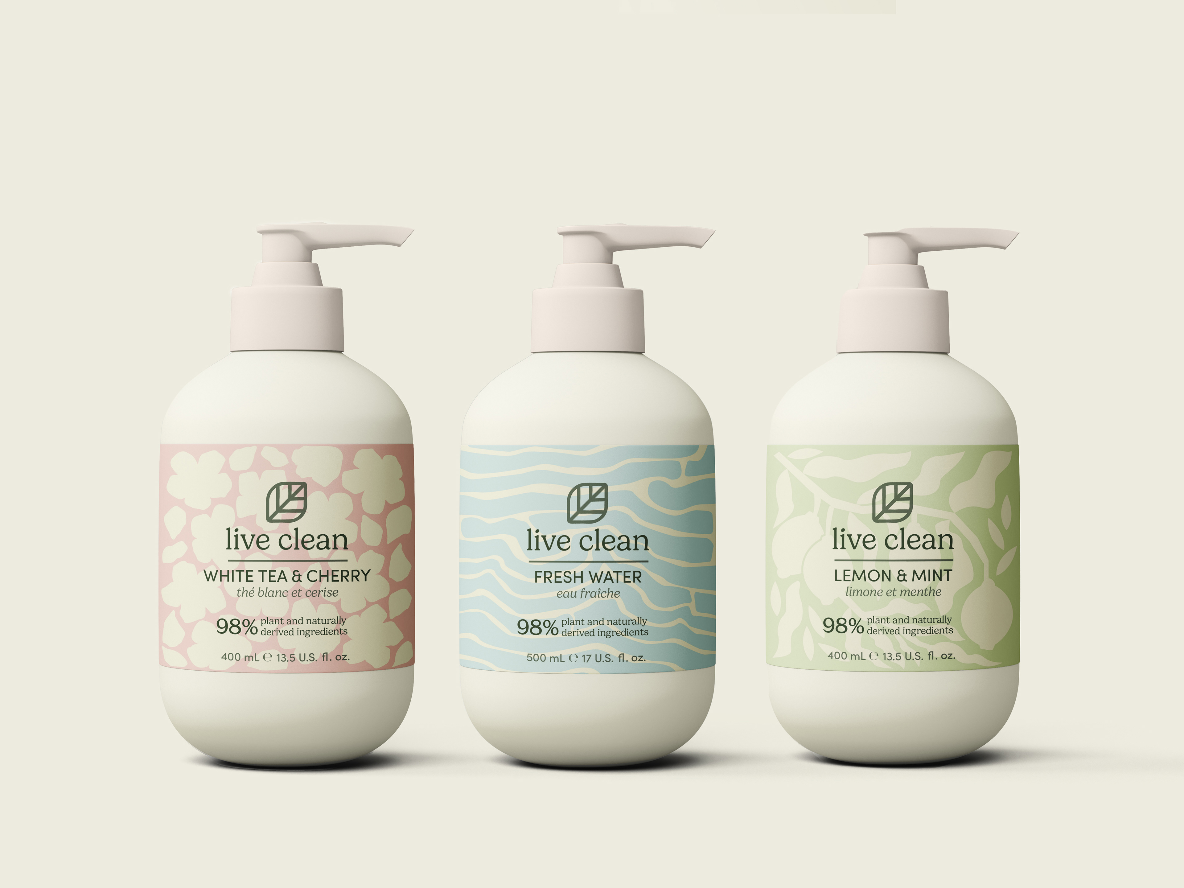
Soap Bottle Mockups
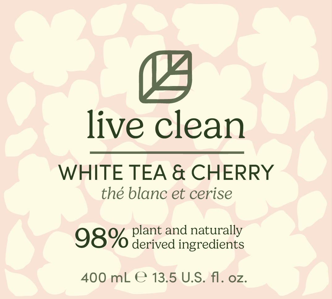
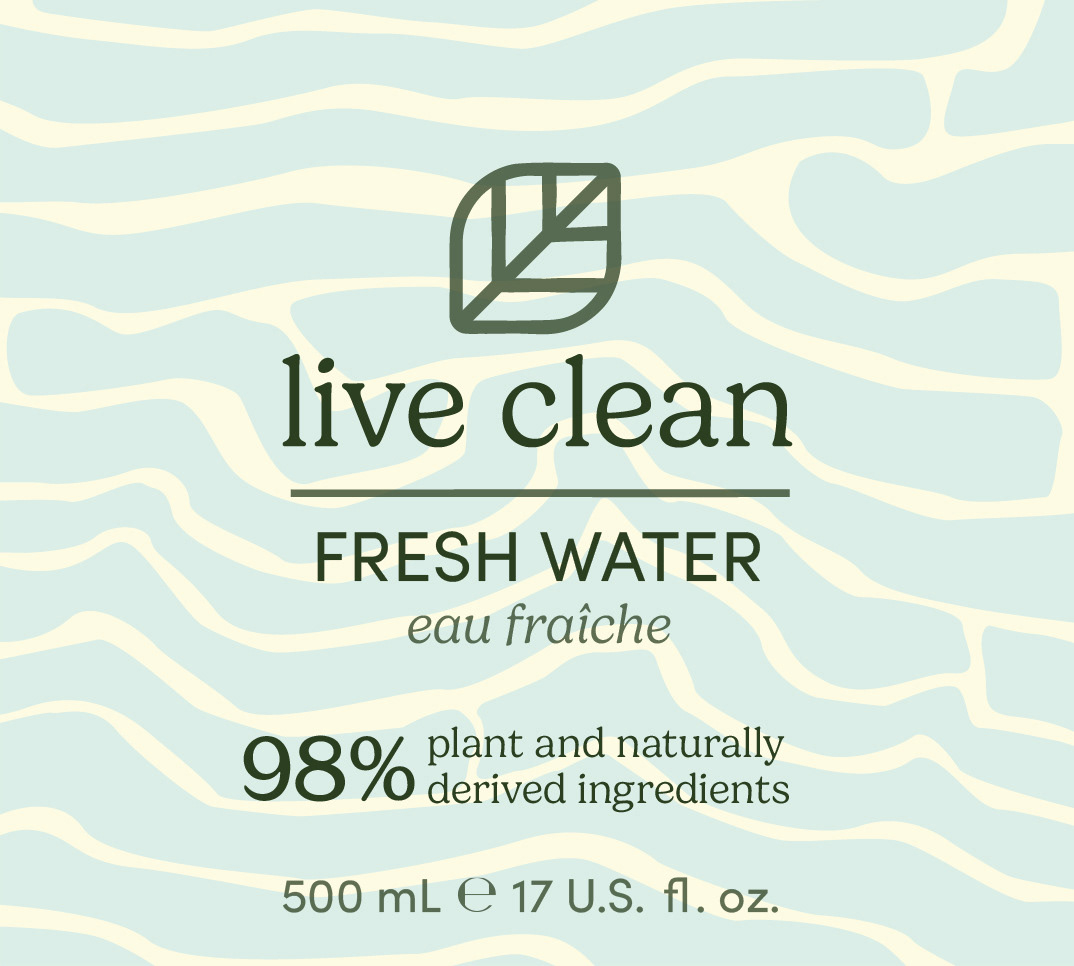
This is my concept for redesigned Live Clean soap bottle packaging, featuring friendly, nature-inspired labels with neutral pastels and abstract illustrations. Each scent has a unique colour and illustration to reflect its personality. I also gave the logo a subtle refresh to better align with their kind, sustainable and modern values.
I used the font Gelica for the primary logo typography. This font appears friendly, soft, and natural, perfect for a company that takes pride in living "kind and sustainable".
I was careful to make the logo design look appealing to a millennial audience, while still maintaining a look of affordability. Many of the sans-serif fonts I was considering appeared too expensive or classy. I chose a dark green colour for the primary logo colour, to maintain a sense of cohesiveness with the existing brand identity. In their bottle label designs, the colour of the logo changed depending on the scent of the product. I found these variations in colour to be too drastic, so I made it my goal to unify the logo identity and create consistency — in turn, a strong visual identity.
I was careful to make the logo design look appealing to a millennial audience, while still maintaining a look of affordability. Many of the sans-serif fonts I was considering appeared too expensive or classy. I chose a dark green colour for the primary logo colour, to maintain a sense of cohesiveness with the existing brand identity. In their bottle label designs, the colour of the logo changed depending on the scent of the product. I found these variations in colour to be too drastic, so I made it my goal to unify the logo identity and create consistency — in turn, a strong visual identity.
My logo design is simple and clean, with a soft and natural feel. Rounded corners match the sense of friendliness and comfort that the brand vision proclaims. I am unsure as to whether or not the teardrop shape of the original leaf logo meant something important to the company — it is for this reason that I am not as attached to the final logo as I am to the font or packaging designs. I chose to move forward with the leaf pointed towards the right, with no teardrop shape, but if needed, the logo could be easily changed to keep that same teardrop motif.
I chose to use off-white, recyclable bottles for the soap. Not only does this pay tribute to the original designs, but it remains a cost-effective yet sustainable packaging option. For the labels themselves, I decided to create my own abstract illustrations representing each scent. These backgrounds provide visual interest, while still being appealing on both bathroom counters and on store shelves. Each label has a colour to match the scent, but the colours are neutral pastels rather than unnatural saturated hues. I used a consistent cream colour throughout to create a sense of brand unity.