Cover

Inside
Close-up of interior text
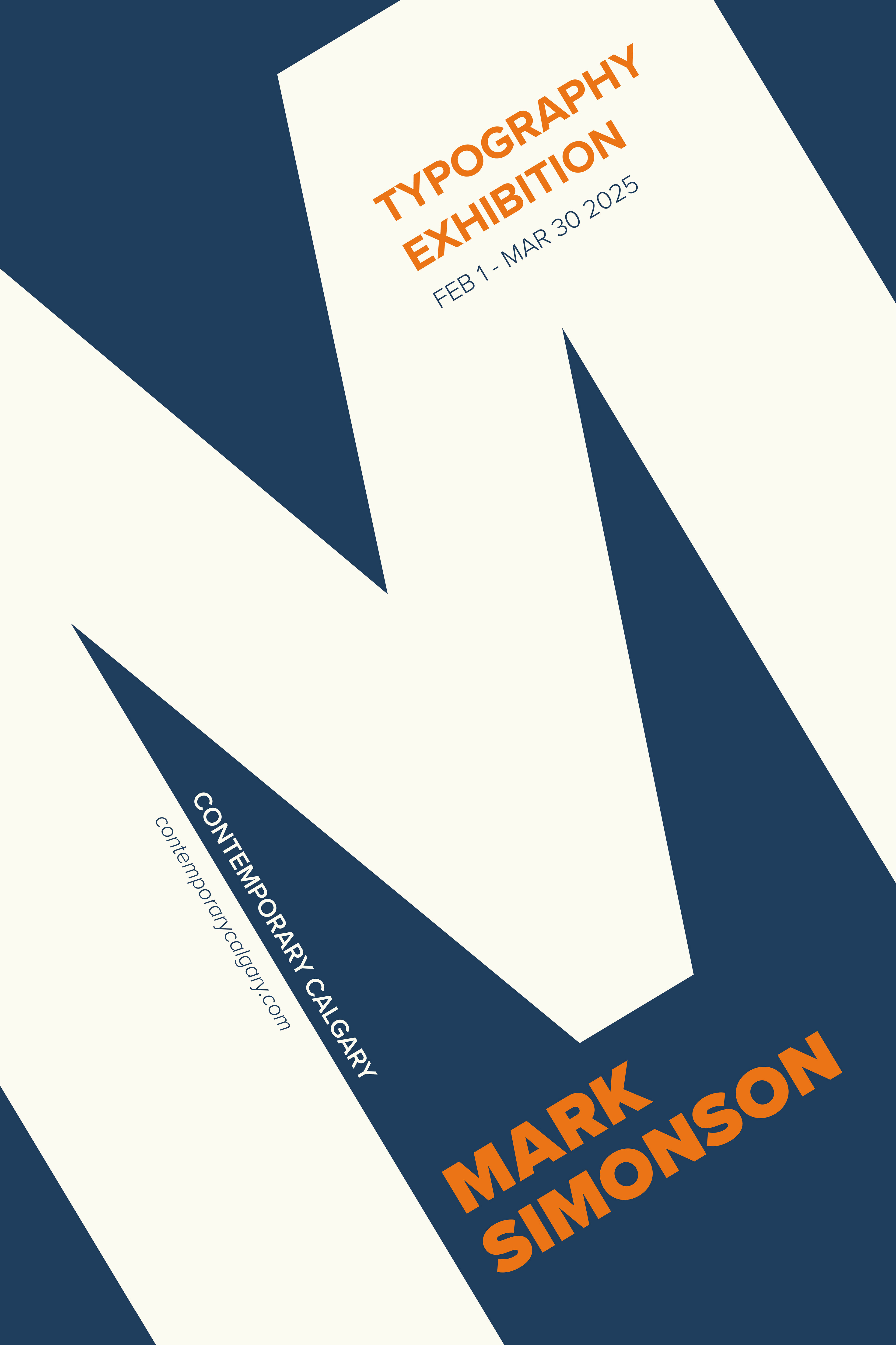
This assignment explores type as a design element and as information. The objective is to design a retrospective exhibition poster for a typographer using only the typeface(s) that the typographer created. The poster should capture the essence of the typographer or one of his/her typefaces. In this case, Mark Simonson’s “Proxima Nova”.
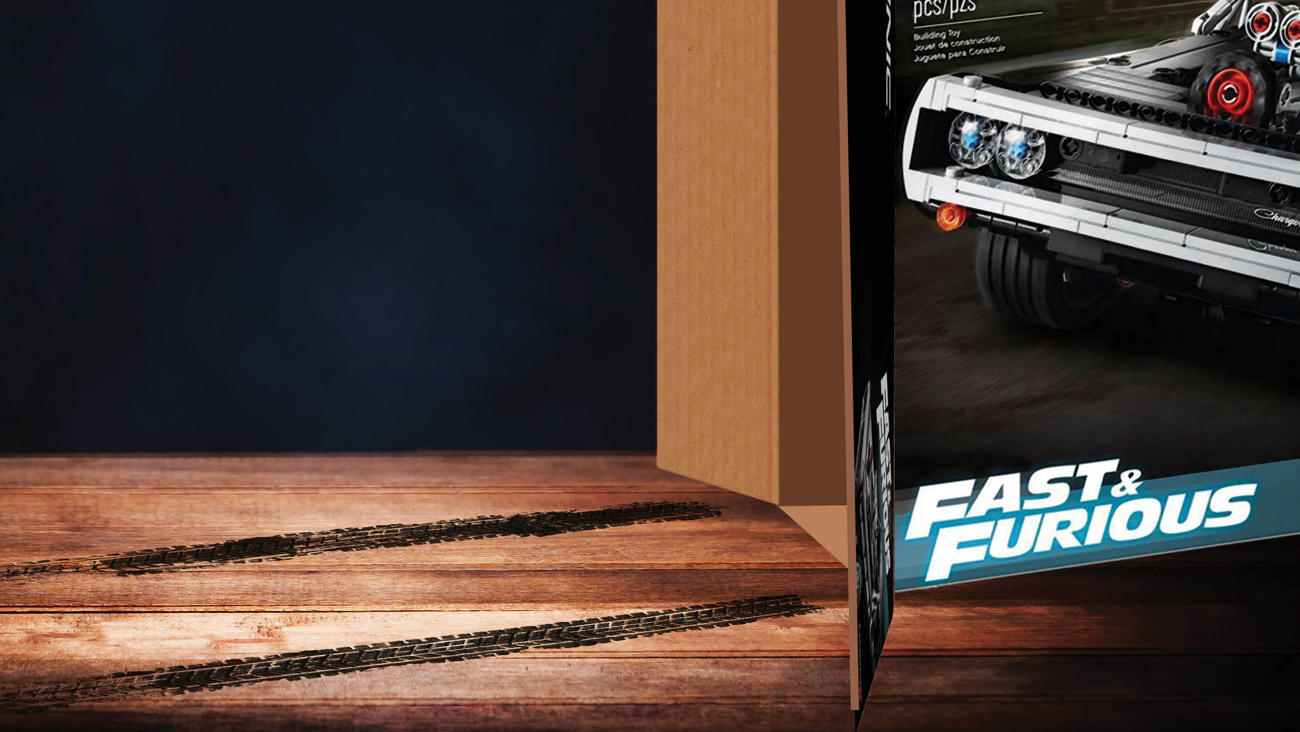
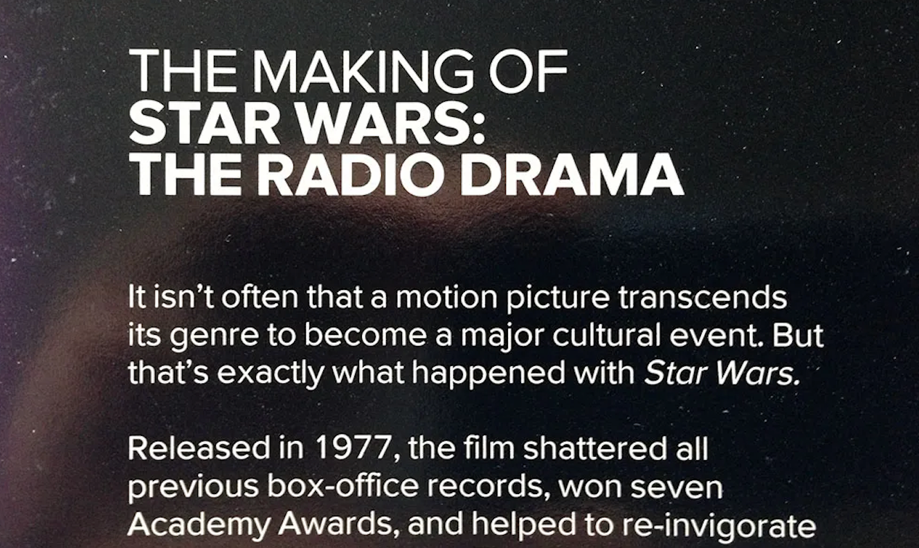
The letter “M” may seem simple, but by cropping and tilting the letterform, an interesting composition can be created. I used different font weights to create hierarchy and balance within the composition. Proxima Nova is a simple yet versatile font, and I wanted to emphasize this in my poster design. I was influenced by the Star Wars audio cassette packaging project that was the first public use of Simonson's font Visigothic, which led to Proxima Sans being released approximately 1 year after. When thinking of Star Wars, I came up with a colour scheme reflecting the blues of space, lightsabers, fire and R2D2.
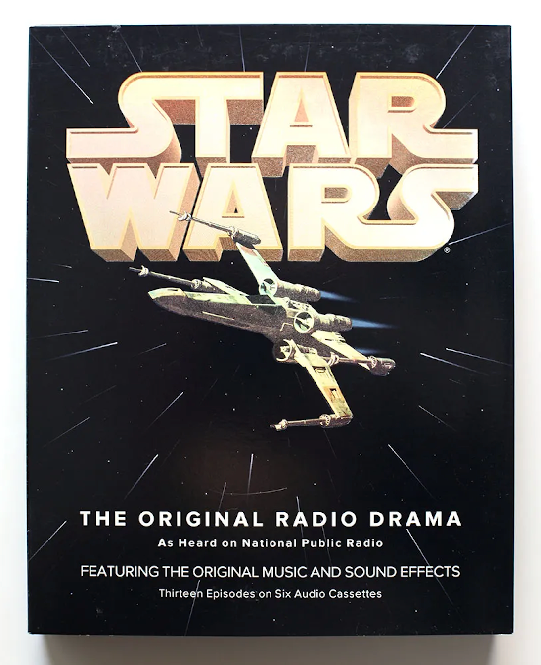
Examples of the Star Wars: The Original Radio Drama on audio cassette are shown below,
courtesy of Mark Simonson Studio.
courtesy of Mark Simonson Studio.