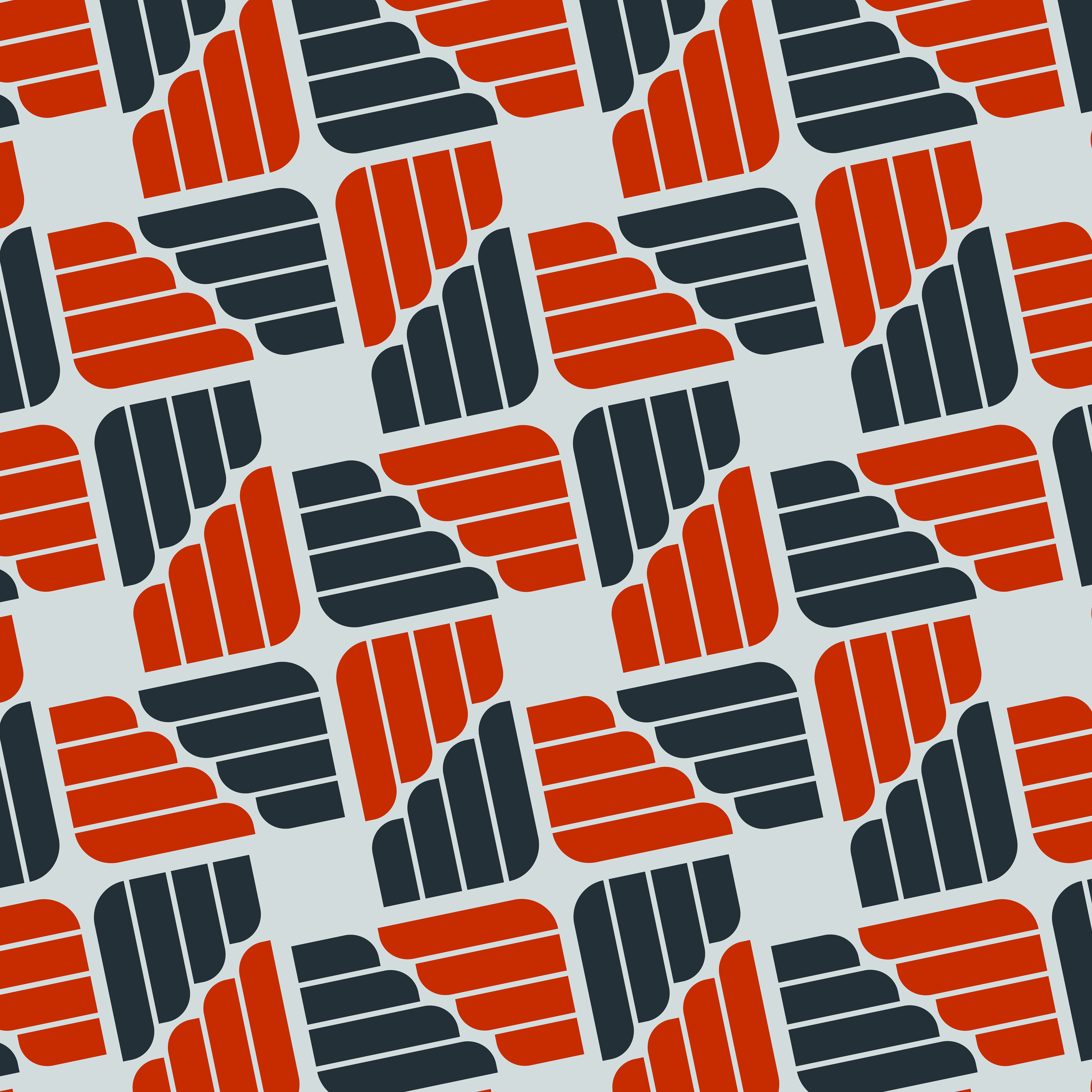
Pattern design

Current Logo v.s. Proposed
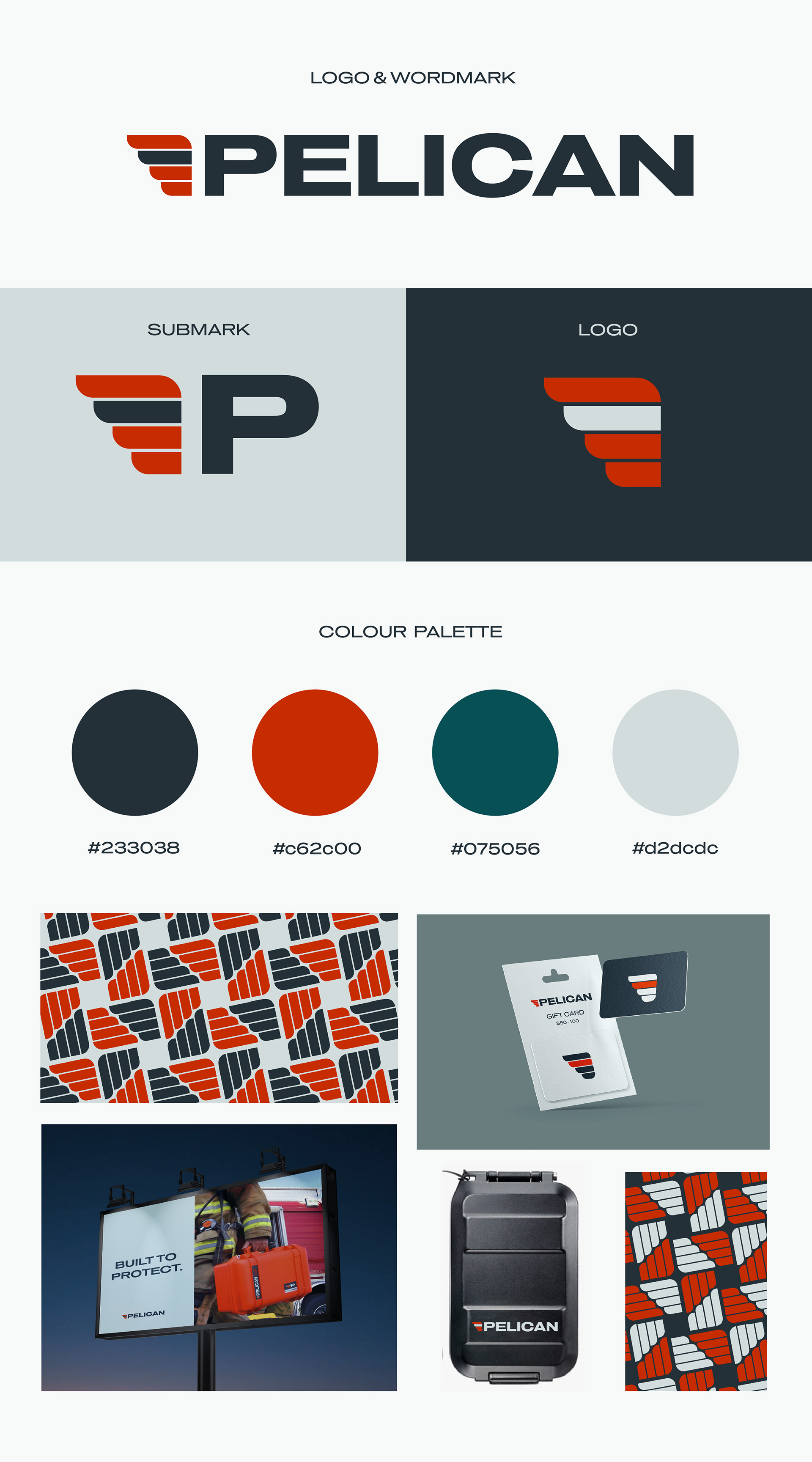
Branding Board
Pelican is a company that makes cases, coolers, and lights that are high-quality and built to last. They aim to raise the bar when it comes to innovation and constant improvement of the technology used for their products. They are constantly exceeding expectations through the quality and flawless performance of products, which can be seen through the many stories their customers have shared.
For this logo redesign, I wanted to incorporate aspects of the former brand identity and original logo while also creating something new and unique. I noticed that there was a lot of movement in the original Pelican logo, however, I felt that it wasn’t working with the brand’s core values. Pelican prides itself in protective, strong and durable cases, so I wanted to reflect this sense of grounded strength and durability in my logo and font choices. I chose to use a wide, stable font that has a similar lineweight to the original font but without the italics. It is grounded, but also wide like the horizon. This represents the nature and environmental aspects of the brand, as well as their values, which are rooted in sustainability and protection from nature’s tough elements. When creating the logo, I pictured how Pelicans and other birds use their wings to shelter and protect their young.
The wing represents protection, as well as strength. It is well-balanced, simple and stable, unlike the previous logo. This is exactly what Pelican stands for; protection that is built to last. The colour palette is inspired by the dark blues and greens of water, forests and the icy terrain that is beautifully contrasted with the fiery oranges of a pelican’s beak.