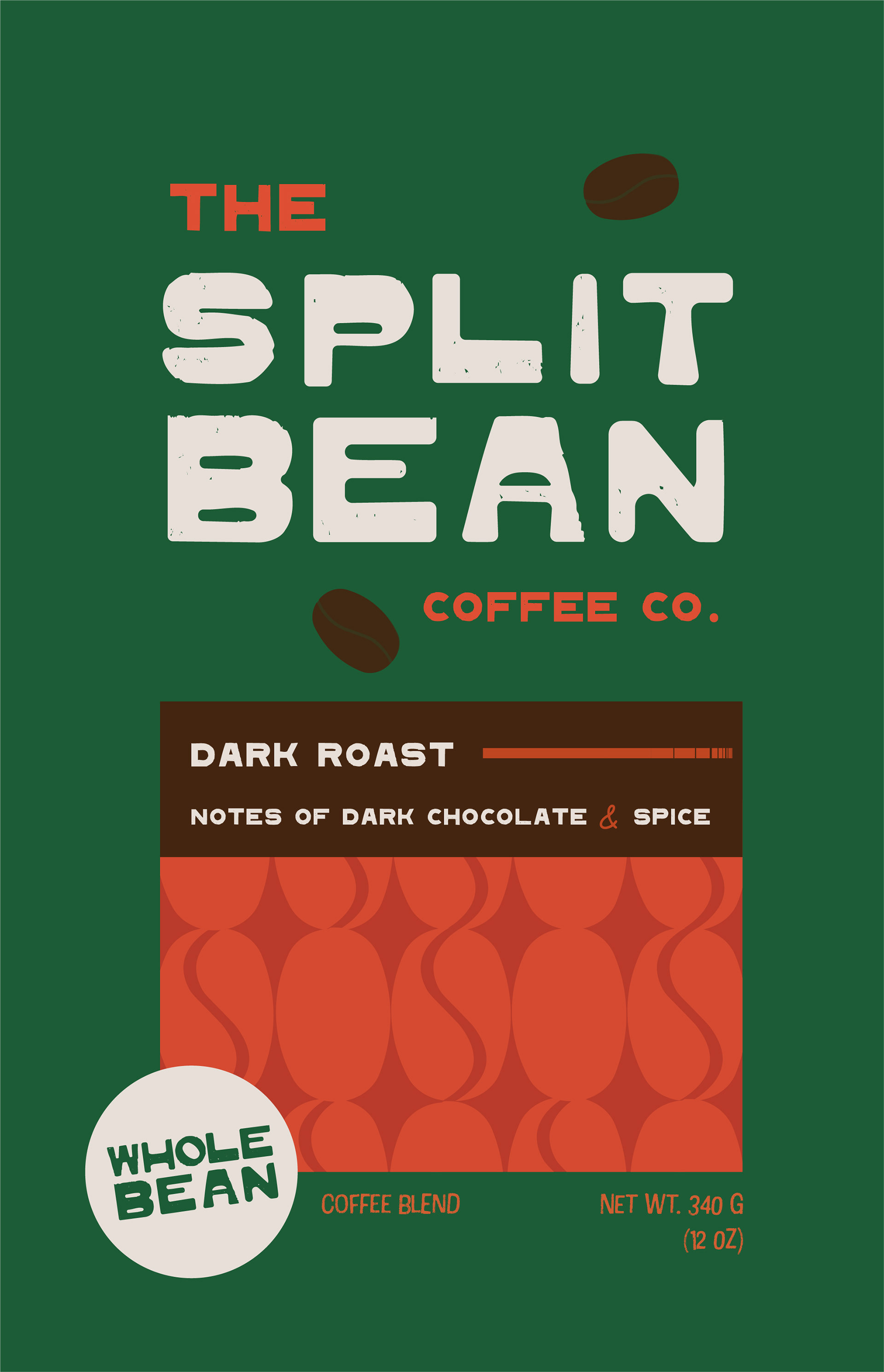
Dark Roast Coffee Bag Design
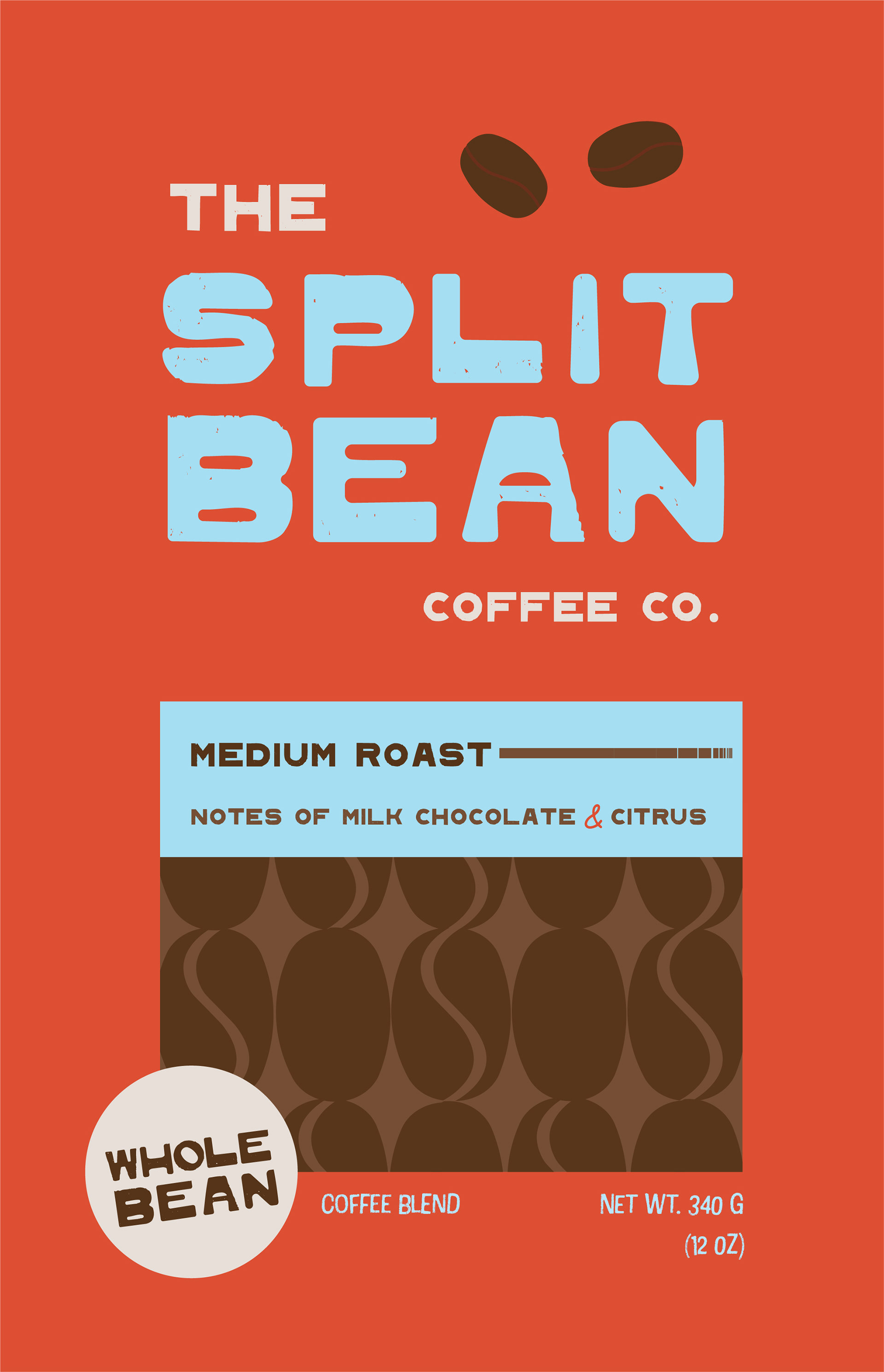
Medium Roast Coffee Bag Design
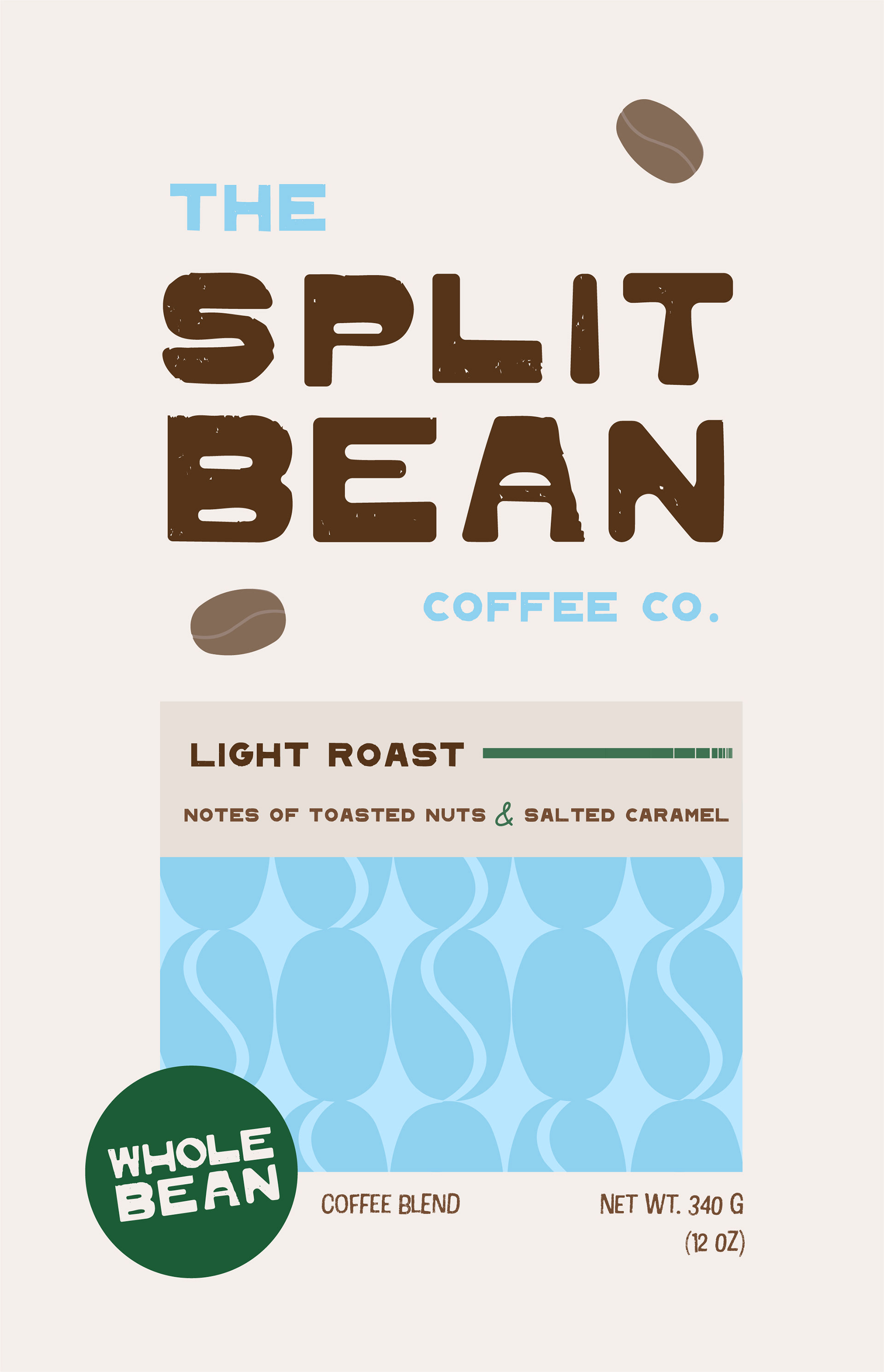
Light Roast Coffee Bag Design

Branding Board
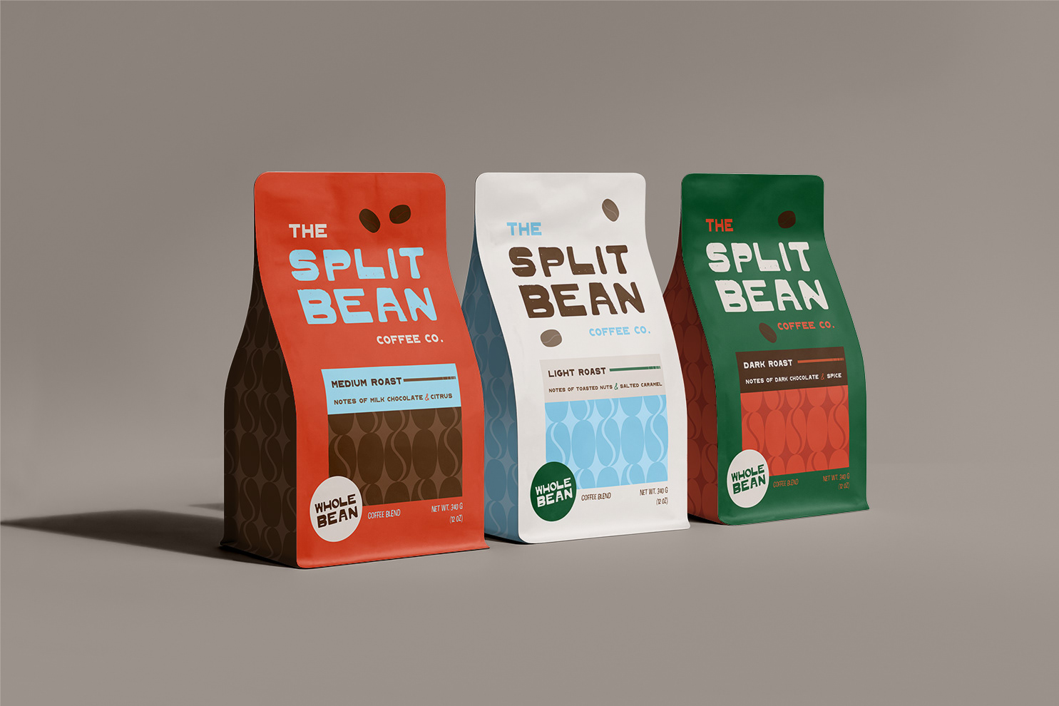
Coffee Bag Mockup
The Split Bean is a fictional coffee shop that is targeted towards young adults and coffee lovers. I modified the font BD Plakatbau for the main logo to achieve the perfect look for this coffee company. The submark is a vertical coffee bean with a split down the middle that forms an "S" shape. Not only is this design ideal for Split Bean, but it also serves as the perfect icon for small applications. The visual identity for Split Bean is grounded in colours inspired by nature: a rich dark green that evokes sustainability and the earthiness of coffee farms, a soft sky blue that suggests openness and freshness, and a vibrant red-orange drawn from the ripe coffee cherry. These colours not only reflect the natural origins of the product but also communicate the brand’s commitment to authenticity and ethical sourcing.
The name Split Bean is visually represented through the symmetrical halves of a coffee bean, symbolizing balance, fairness, and the company’s strong fair trade values. This motif reinforces the brand’s emphasis on community and equality. To differentiate Split Bean from other coffee brands while retaining a sense of familiarity, I developed a bold and unconventional colour palette. While coffee lovers are naturally drawn to earthy tones like dark green and brown, the addition of more playful hues adds a spark of individuality. Typography plays a key role in appealing to the target audience—young adults with an eye for design and an appreciation for current trends. Inspired by retro aesthetics, I incorporated expressive type choices such as the blocky boldness of BT Plakatbau. This gives the brand a funky, youthful edge and reinforces its distinctive, modern personality.
I used Adobe Illustrator to create the logos and patterns, as well as the coffee bag design. Using Photoshop, I applied my coffee bag designs to a mockup to show the pattern on the side of the bag as well as the front. The coffee bean pattern was made using the submark and utilizes positive and negative shapes to create visual interest. I created a set of core values for the brand, emphasizing sustainability, community, fairness and respect. The colour palette, fonts and designs I've created heavily reflect these ideas.
This piece was featured in the February 2025 AUArts SCD exhibition, 'Good Vibrations'.