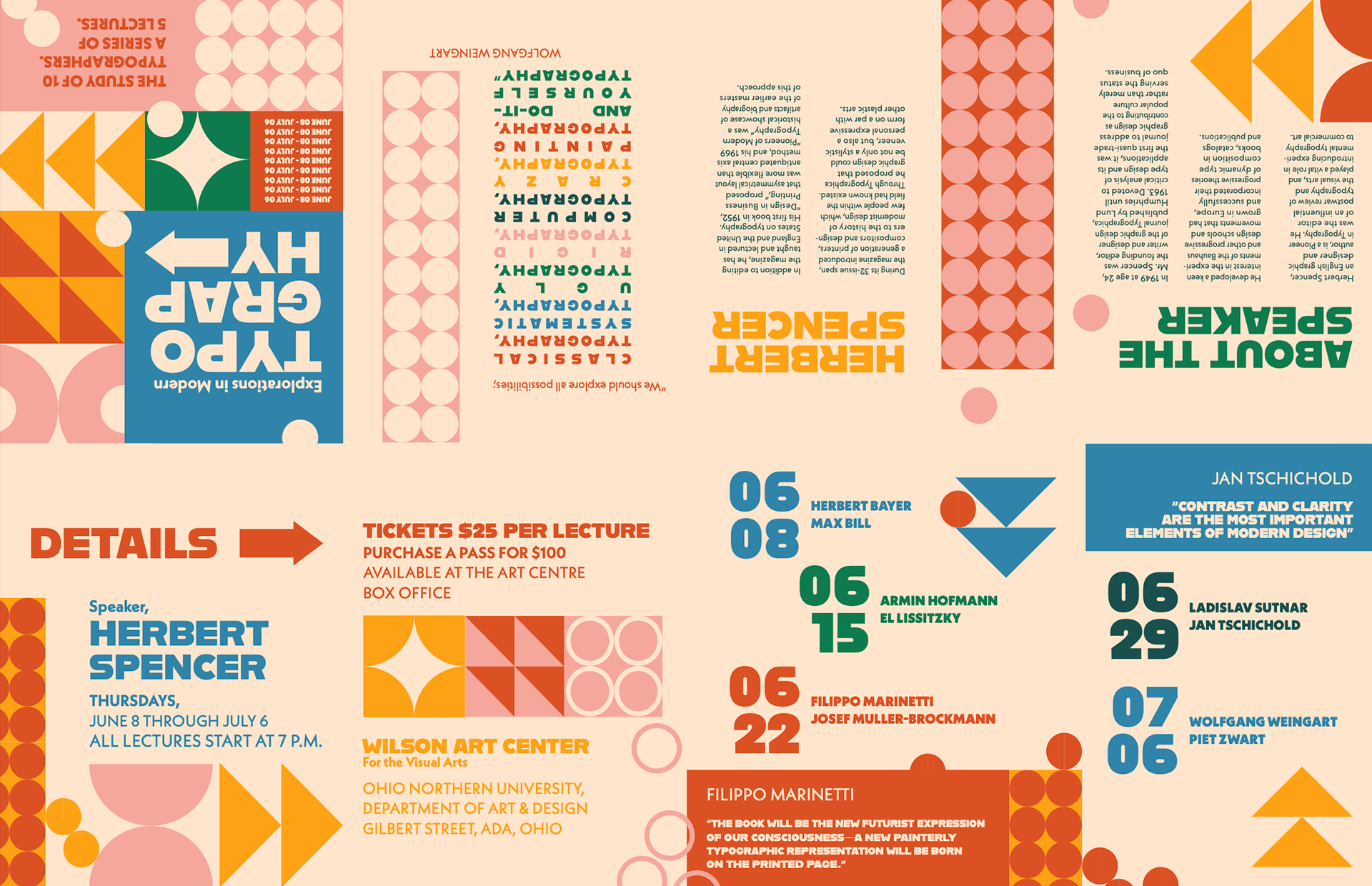
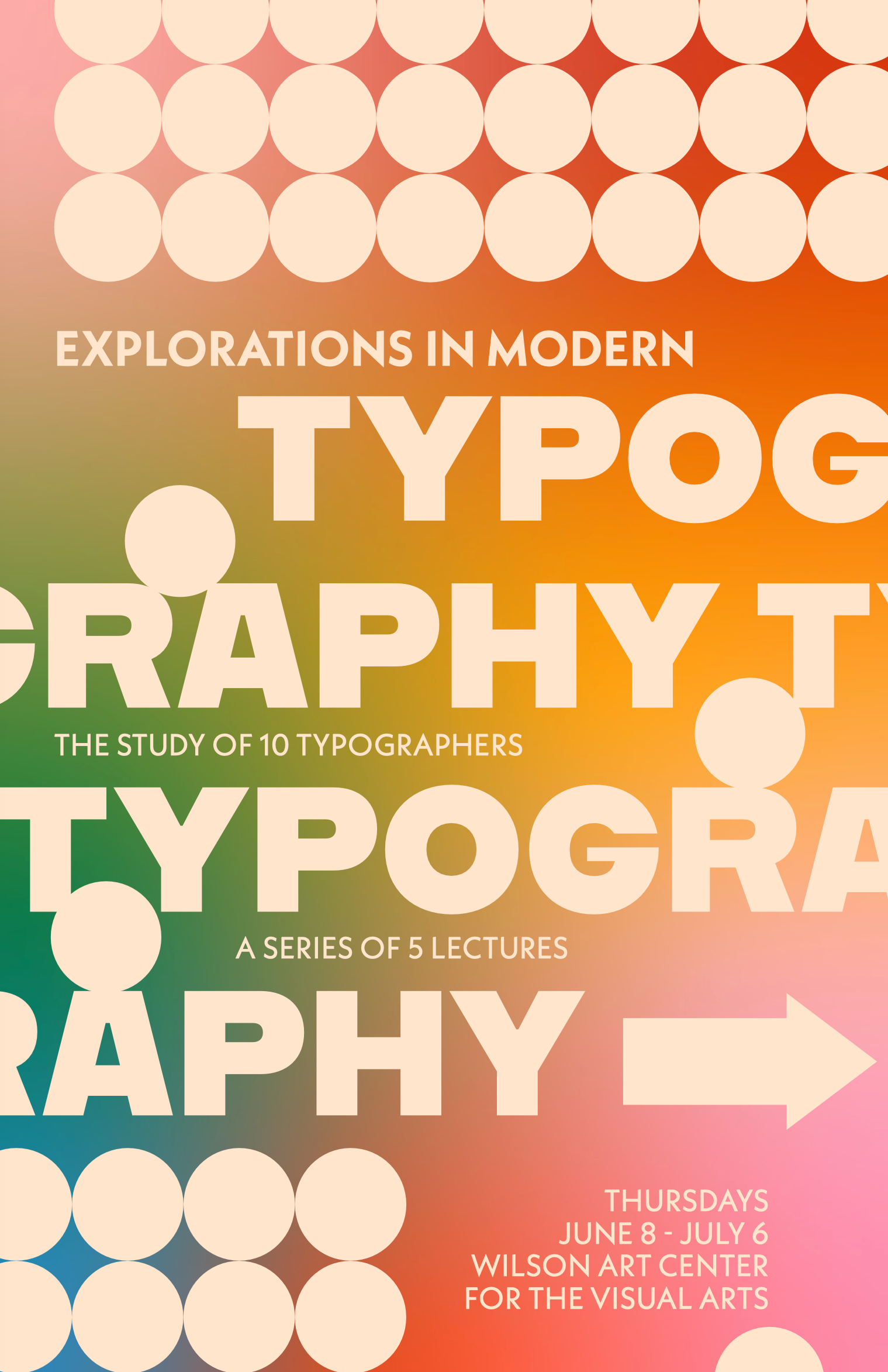
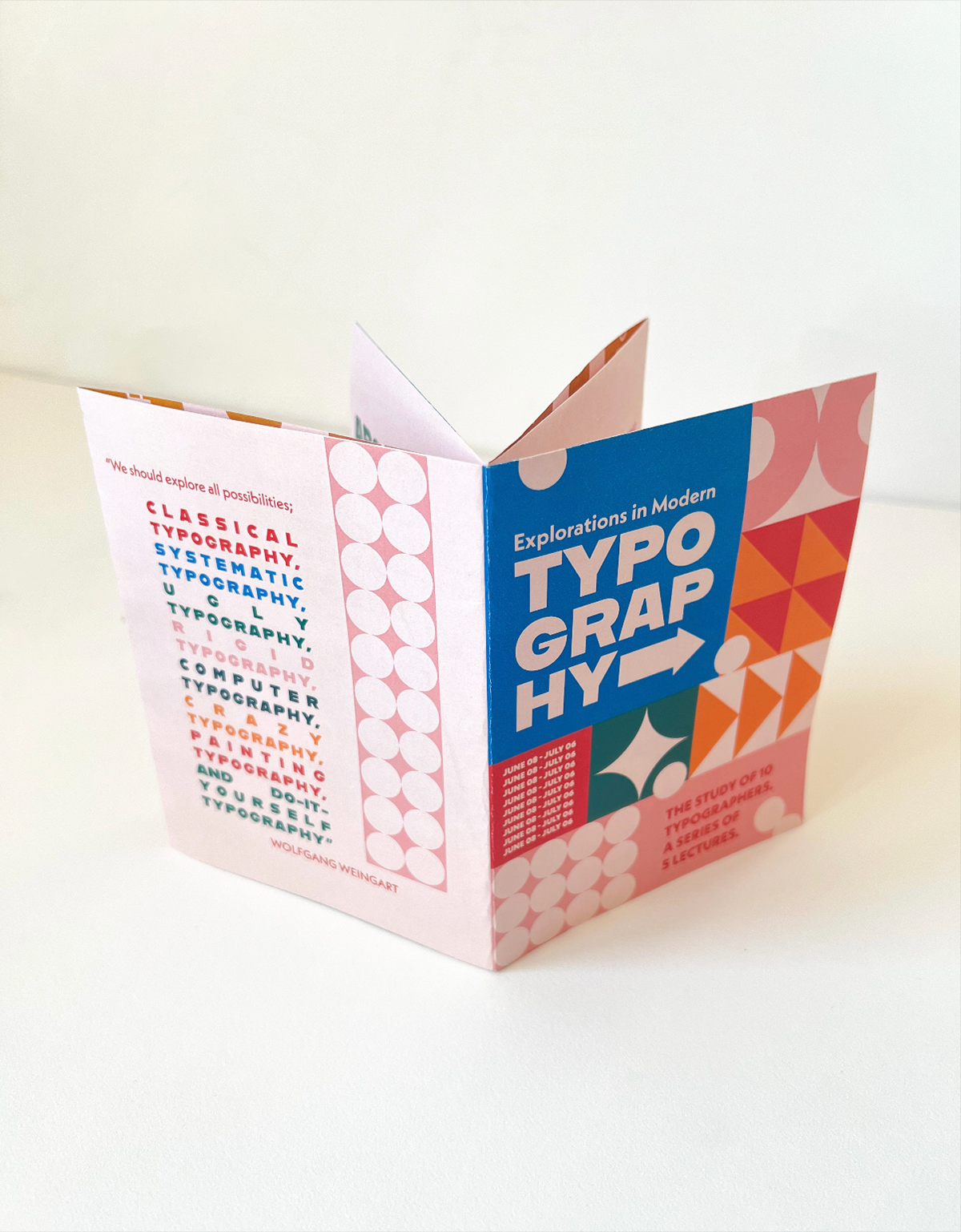
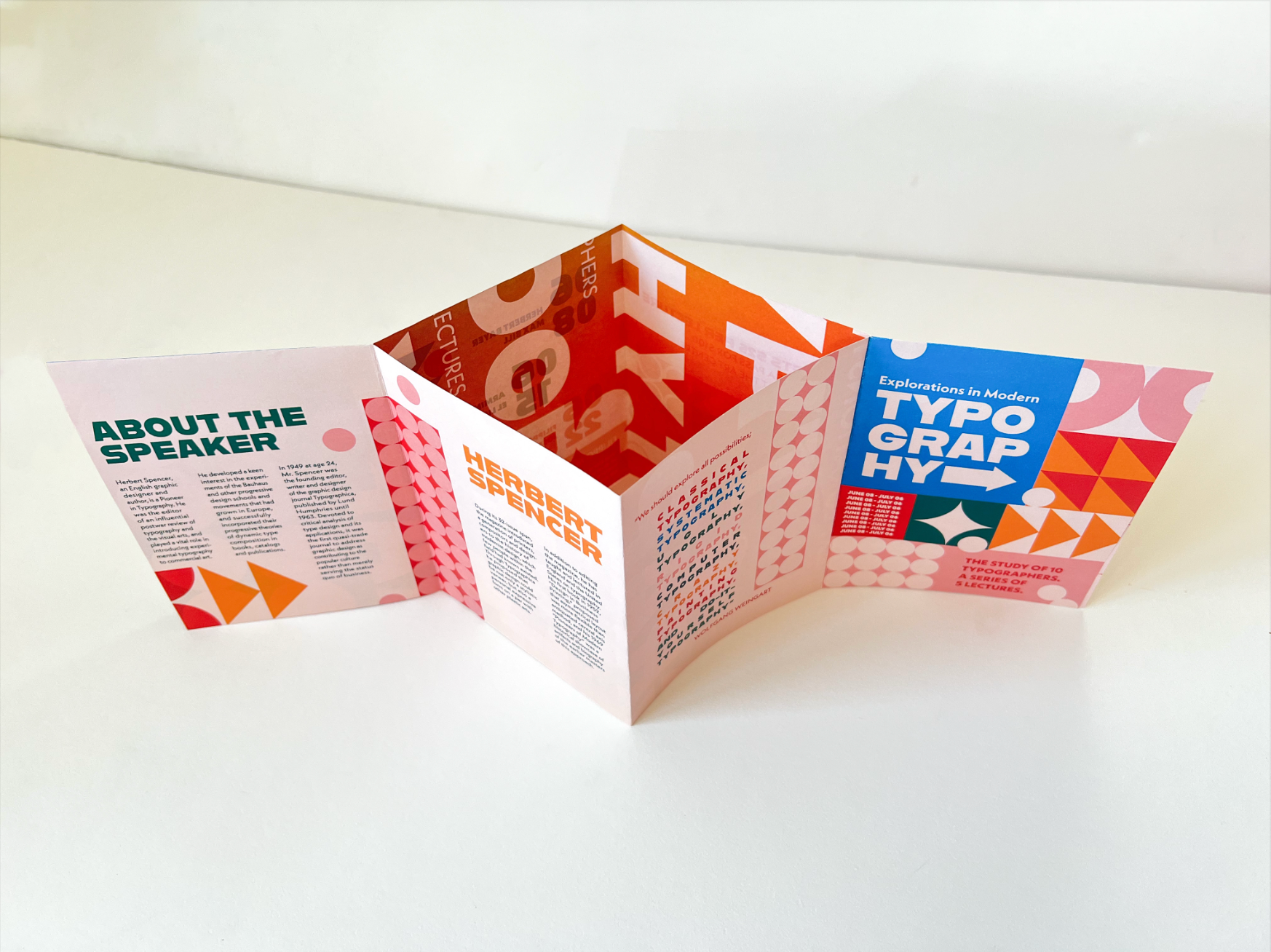
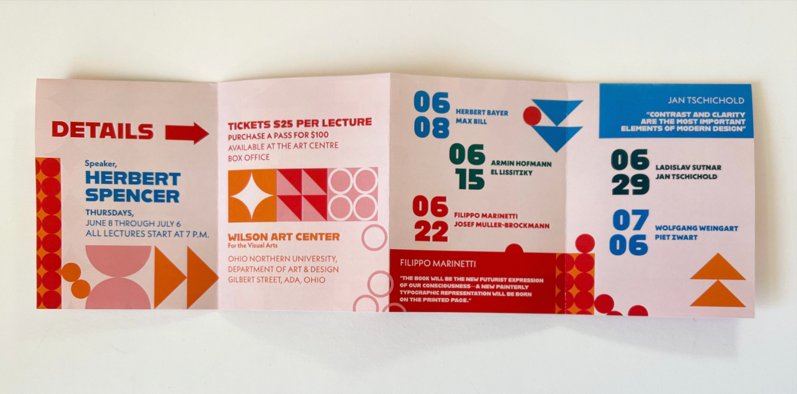
The goal of this typography project is to create a zine and poster design for a fictitious event called Explorations in Modern Typography. The poster is reversible and can be turned into an informative and engaging zine, with details about the main speaker and other event speakers, ticket costs, and event location. The target audience is graphic design professors, students, and other creatives of all genders interested in Swiss and Bauhaus typography.
To best speak to my target audience, I created a zine that is visually engaging and filled with movement and energy. To achieve this, I used strategically cropped geometric shapes, arrows, gradients, and other graphic elements designed to lead the viewer to the next page.
The colour palette, graphic elements, and overall style are a contemporary take on the Bauhaus movement. I was inspired by many of the typographers highlighted in the exhibition, particularly Max Bill’s use of colour and Wolfgang Weingart’s cropping. I used the fonts Alfarn & Neue Kabel to achieve a contemporary Bauhaus style.
It was a challenge maintaining legibility while also making the zine interesting and dynamic for the target audience. I chose to focus on creating movement, directing the eye forward with arrows and shapes. I used playful circle graphics to create visual interest and add dynamic energy to the zine and poster. To capture attention from across a room, I combined the movement seen in my zine with bold typography and mesmerizing colours. These gradient poster colours are visible in the “window” between the zine’s pages, creating added visual interest and contrast.